Optimizing Planograms
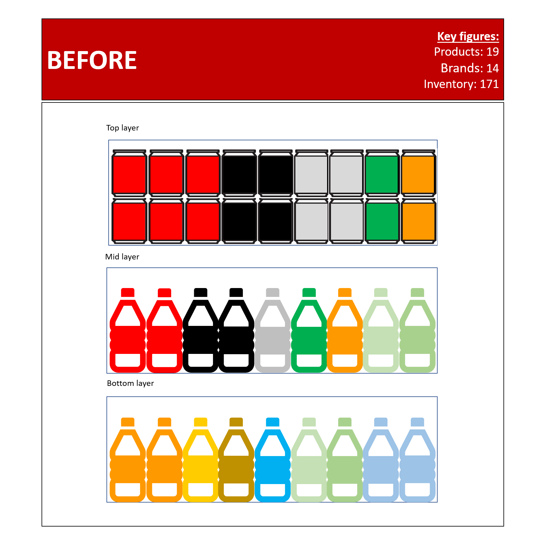
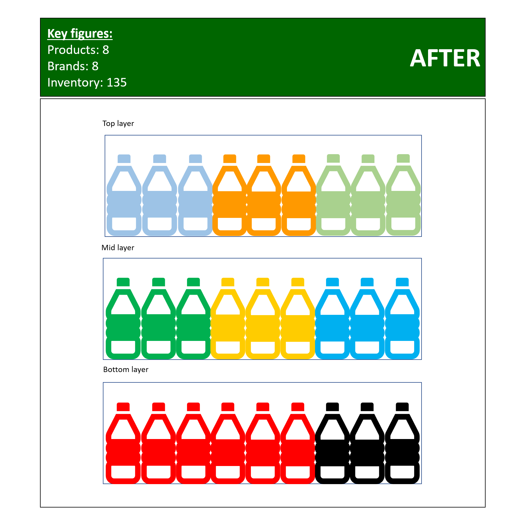
From time to time there is a conflict between the conventional brand-building thought process and sales - and so was the case here. The key account team wanted to maximize sales, whereas the brand team wanted to give shoppers many options. In theory ‘many options’ makes sense, but the operational output at point of purchase, did not fully tally. The Cat Man Team took 30 stores, and tested out our alternative / new planogram.
Before situation:
A: Number of products: 19
B: Number of brands: 14
C: Total inventory / capacity: 171
D: Average inventory per SKU: 9.0 (Max: 24 // Min: 5)
E: GP Index: 100
After situation (What we did):
A: Number of products: 8
B: Number of brands: 8
C: Total invetory / capacity: 135
D: Average inventory per SKU: 16.875 (Max: 36 // Min: 12)
E: GP Index: 133
Ideally we should have created an even simpler planogram, but it all depends of sales, replenishment and brand focus.
Results:
The replenishment went faster, and out of stock level was lower. The new planogram was just more elegant and more relevant at point of purchase, and became the new standard for the bottler. Every brand grew with the new planogram, despite having less capacity, and fewer SKUs. Due to the fact that we stacked SKUs with a higher Gross Profit, the value grew faster than the lift in volume.
By the numbers:
Volume: +35%
Value: +60%
Inventory / Capacity: -21%
End note
Simplicity sells when dealing with impulse purchase under stress. The old planogram was rather messy, hence each SKU was not a magnet resulting in sales. The new planogram only focused on pure mobile packs with closures; hence no cans were to be placed in cooler.
Too many SKUs congested in one small place, is normally reducing the purchase intent.
People namely hate bad more than they love good.
In the brand planogram, people had to say ‘no’ to 18 products, which was a factor limiting the reduced off-take.
In the new planogram, people only had to reject seven products; hence were a catalyst for higher purchase intent.


